In this article, we show gold’s developing story in 7 amazing charts.

As usual, we look at gold from different angles. If anything, it becomes clear that the precious metals market is nearing a pivot point. We cannot be sure in which direction this will resolve, we can only keep on monitoring the developments in the weeks and months ahead until we see a trend. Based on our analysis, we are quite convinced that a new trend in precious metals will arise in the next few months.
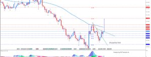
Chart-wise, gold looks like a cooking pressure, not in terms of price or momentum, but in terms of its chart pattern. The recent sideways action can go on for a while longer, but the descending triangle formation on the chart is reaching its apex. In our own words: we are nearing a make-or-break level.

Besides, the US dollar broke above critical resistance, and is currently in the process of testing it.

The dollar on a higher timeframe (i.e, the monthly chart) puts the recent rally in perspective. The greenback broke through a 30-year trendline, which is being tested again “as we speak.” This has the potential to become truly pivotal for markets around the world, not only for precious metals.

Dr. Copper, the barometer of the world’s economic health, is also about to reach the apex of a mega-triangle that has been developing for more than a decade. Soon we will know more about the true state of the global economy.

Inflation expectations, the key driver for gold’s price in the last decade, has shown a divergence with the yellow metal for 1.5 year now. Inflation expectations are also nearing a breakout or breakdown point as seen on the chart (red line, red triangle). Note the divergence between gold and inflation expectations on the chart, which is not yet providing a clue about the future direction. The only observation on this chart is a rising level of inflation expectations as evidenced by the higher highs of the red line since 2013.