Gold Stocks Jump and Retrace 50%
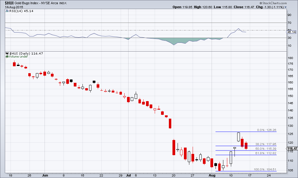
Last week we discussed the potential for a rally in the gold sector (see: “Gold Stocks at an Interesting Juncture” for details). Gold stocks jumped early in the week and then retraced almost precisely 50% of the initial move higher, in the process closing a gap that was left behind on Wednesday.

Image credit: dreamstime.com
Interestingly, for the first time in many months, there were three up days in a row prior to the retracement move:
Click on picture to enlarge

The HUI Index daily: a jump from 104.50 to 126.25, followed by a 50% retracement: ideally the advance should resume from here
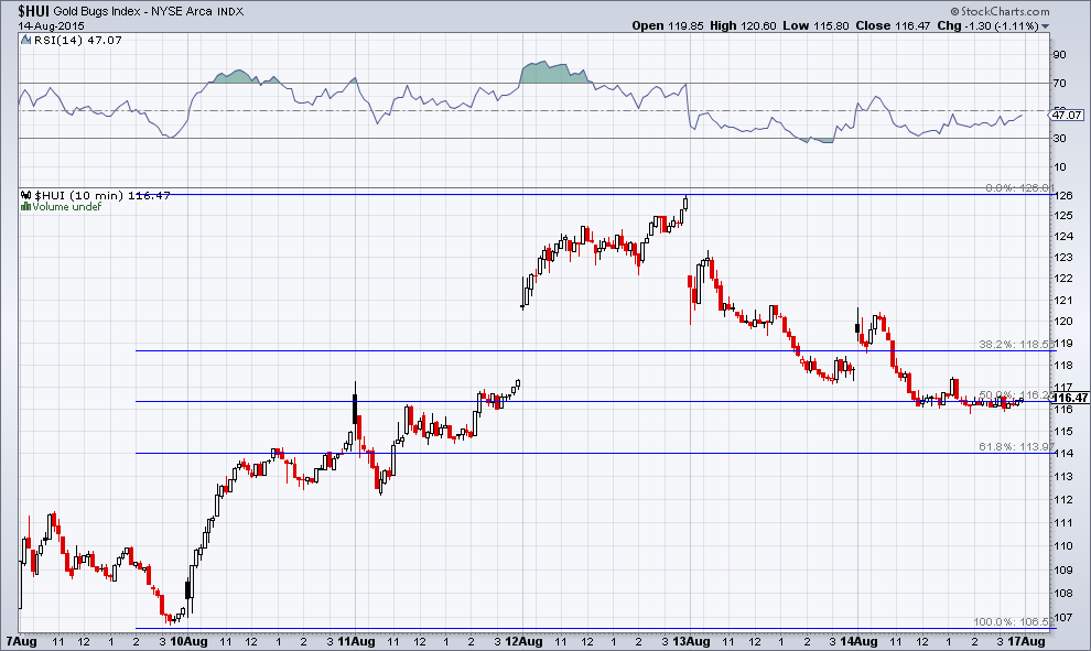
On a 10 minute chart of the HUI index zooming in on the entire move since the low of August 7, one can see that the retracement includes a saucer-shaped sideways move that was put in during Friday’s trading session right at the 50% mark.
Note that the 50% mark appears slightly higher on a 10-minute log chart than on the daily log chart shown above, mainly due to the different scale of the chart. It is nevertheless fair to say that there has been a 50% retracement of the initial move off the low so far.
Last week’s action reminded us of the 1992/1993 low. At the time, there was a big single day move higher in the Johannesburg Gold Index shortly after the low had been put in, which was almost completely retraced the very next day. The rally resumed shortly thereafter. The XAU behaved differently in 1992/3, but as you will see further below, the chart nevertheless provides interesting information.
First a look at the above mentioned 10 minute chart though, which is informative as well:
Click on picture to enlarge

A 10 minute log chart of the HUI since the low on August 7. The point of showing this close-up is to illustrate the difference between the advance and the pullback. For once, the former exhibited more urgency, and looks “impulsive”, while the latter has so far a more “corrective” look. Of course this can easily change again, but this is the situation as of Friday’s close
Sentiment – Gold Remains the Most Hated Asset
Before we move on the 1992-1993 chart, here is a list by sentimentrader, which shows a comparison of the so-called “optimism indexes” for major commodities. The numbers show the bullish consensus as a percentage.
Here is sentimentrader’s explanation how these indexes are calculated:


