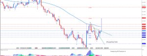
I spent a lot of time recently looking at the long-term index charts. We’re all familiar with the history of the Internet Bubble and the Housing Bubble. How gigantic they were, how they were fueled by puffery or outright lies, and how the housing bubble in particular was made possible through completely bogus credit ratings. Both of these prior bubbles were powered by Alan Greenspan and his multi-trillions of largesse, and they both had historic wipeouts.
But what struck me – really, really stuck me – was how PUNY those two bubbles were compared to the ascent we’ve seen over the past nine years. I mean… just look at this!

Both ascents and crashes are small blips compared to the present bull market.
Here’s another way to look at it. I made a bar in the chart below, in magenta, equaling the size of the entire housing bubble. I moved that bar to the right side of the screen, and then I added a second bar, in green, showing how much EXTRA the bubble-on-top-of-a-bubble required to traverse the entire span. It’s kind of like two and a half Housing Bubbles in one.

The small caps provide another poignant example. The massive top in small caps from 2007-2008, highlighted with my spiffy arc tool below, looks trivial (as does the so-called financial crisis following it) compared to the multi-hundred-percent that came afterward.

To be clear, all the charts above are log charts. I haven’t displayed them as arithmetic charts for visual drama. But that’s easy enough to do…

I’m sure you get the point by now. What we’re in right now isn’t a “bubble.” It’s something different, and something much, much bigger.