The evidence continues to mount…
“Most since Lehman” has become the new meme for macro-economic data in the US as day after day brings another lackluster superlative to be dismissed with some excuse by the cognoscenti of sell-side economists…

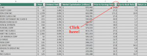
Of course, that is aside from anything related to aggregate jobs that is spewed by the government’s official ministries of truth… (do not look at this chart)

* * *
So here are seven charts that scream “recession” is here…
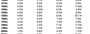
Retail Sales are weak – extremely weak. Retail Sales have not dropped this much YoY outside of a recession…

And if Retail Sales are weak, then Wholesalers are seeing sales plunge at a pace not seen outside of recession…

Which means Factory Orders are collapsing at a pace only seen in recession…

And Durable Goods New Orders are negative YoY once again – strongly indicative of a recessionary environment…

Which is not going to improve anytime soon since inventories have not been this high relative to sales outside of a recession

In fact, the last time durable goods orders fell this much, The Fed launched QE3 – indicating clearly why they desperately want to raise rates imminently… in order to have some non-ZIRP/NIRP ammo when the next recession hits.
And just in case you figured that if domestic prosperity won’t goose the economy, Chinese and Japanese stimulus means the rest of the world will save us… nope!! Export growth is now negative… as seen in the last 2 recessions.

And deflationary pressures (Import Prices ex-fuel) are washing upon America’s shores at a pace not seen outside of a recession…