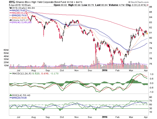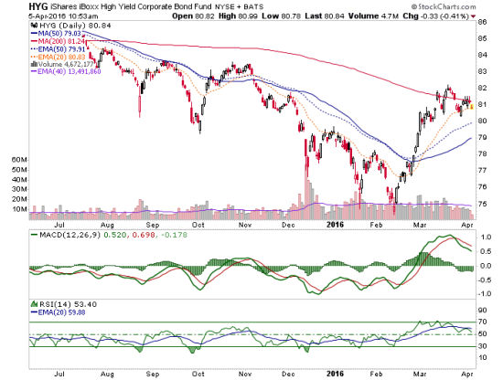
This little short-term pattern does not look too appealing as HYG looks foiled on its 3rd attempt at the 200 day moving average.

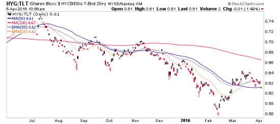
High Yield vs. Treasury is dropping below the SMA 50 in a similarly gross looking pattern.

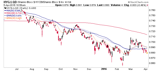
Finally, HY vs. Investment Grade is even worse.

These charts made hard bottoms in February when it was time to get bullish. Now they are highly suspect to bearish. We can do the math. I have been short HY for a couple weeks now.


