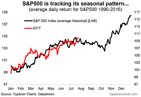
Following on from the popular post on the seasonal turning point for the VIX last week, here’s an insight into seasonality for the S&P 500 and how 2017 is tracking YTD vs the historical seasonal pattern. The first chart shows 2017 superimposed on the historical average and it looks like a fairly decent fit with the implication being that the next couple of months will bring a bearish bias.
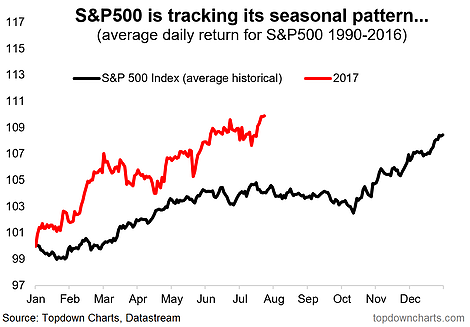
The second chart shows the two series on a single axis and the same broad conclusion holds – the seasonality seems to be showing through so far, but the other thing to note is that 2017 is outpacing the historical average by a healthy margin. It could certainly continue to outpace through year end, but one interpretation would be that the average annual gain has already been banked, leaving upside in question.
The usual caveats apply about seasonality not always working, and having a habit of breaking when you rely on it. “Seasonality is a contributing factor, additional information, not a core thesis.”
Here is the year 2017 so far superimposed over the average historical seasonal pattern. The point of superimposing it is to match up the pattern as individual years will almost always had much wider variation and volatility than the average.

For completeness here’s the two series on a single axis, which brings broadly the same conclusion, but one thing to note is that 2017 is outpacing the historical average by a healthy margin, so that’s something to note.


