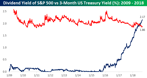
As interest rates have risen over the last few months, we have seen a number of charts similar to the one below comparing the yield on the 3-Month US Treasury (UST) to the dividend yield on the S&P 500. Up until just a couple of months ago, this entire bull market has occurred during a period where short-term interest rates have been lower than the dividend yield on the S&P 500. After over two years of rate hikes from the FOMC, though, short-term interest rates rose above the S&P 500’s dividend yield this summer and have continued higher ever since. With yields crossing this key inflection point, there’s been a decent amount of chatter that the higher yield on cash makes it more attractive than equities given their lower yield.

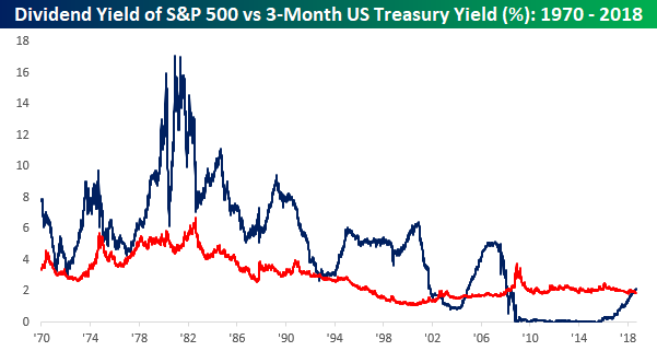
While any trader under the age of 30 (or algorithm using just ten years worth of history) has never known a world during their career where the dividend yield on equities was less than the yield on short-term Treasuries, those who are older or familiar with market history know that it is much more common for equities to yield less than short-term Treasuries. The chart below is the same as the one above except that instead of going back to just the start of 2009, it goes all the way back to 1970. As shown, prior to 2009, instances, where short-term Treasuries yielded less than the S&P 500 were few and far between. After all, unless you have some short-term needs for the capital, who would want to own an asset with zero upside potential (short-term treasury) if held through maturity that pays a lower coupon than equities, which outside of a couple of periods have always increased in value?

Below we compare the spread between the yield on the 3-month UST to the dividend yield of the S&P 500. While short-term Treasuries currently yield nearly 31 basis points (0.31%) more than the dividend yield of the S&P 500, that spread is still more than 150 bps below the historical average. Furthermore, even when the spread has been above the historical average, it has hardly represented a warning sign for equities. Throughout the entire mid to late 1990s period and nearly all of the 1980s (two very strong periods for equities), the spread was not only positive but well above the long-term average as well. The only thing that makes cash look less trashy when it is yielding marginally more than the S&P 500 is when it follows an outright garbage period of years where it yielded less.


