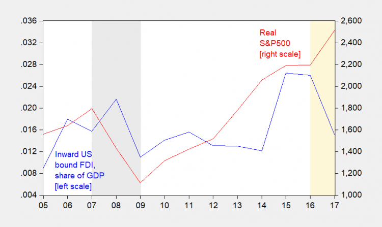
Plotting nominal dollar value of inward FDI understates the collapse in inflows. Here is the ratio to GDP, and — considering how FDI covaries with the stock market’s level — the real S&P 500 (As I recall, working on this topic during the dot.com boom, the dollar’s strength was the other important factor — but that hasn’t changed much over the last three years.)

Figure 1: Inward US bound FDI as a ratio to nominal US GDP (blue, left scale), and real S&P 500 (red, right scale). NBER defined recession dates shaded gray. Trump administration denoted by orange shading. Deflation using CPI. Source: OECD, BEA 2017Q3 advance via FRED, Robert Shiller, NBER, and author’s calculations.
Note that given the correlation between stock prices and FDI, I would’ve expected higher levels of inflows. If you are wondering why, remember that for the US, greenfield FDI is a small share of total.
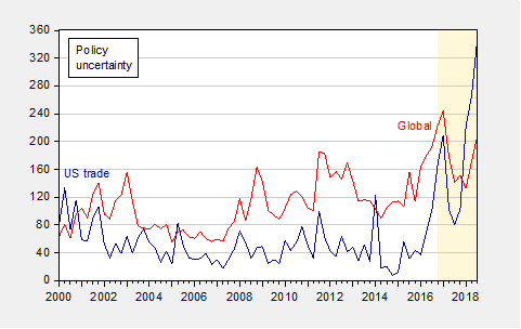
It’s been observed that world, OECD, as well as US, inflows have all declined, to varying degrees. The US is itself a large share of world FDI inflows. Moreover, just because it’s happening worldwide doesn’t mean the US isn’t the source of the shock. As I documented in my article in the Nikkei newspaper, global economic policy uncertainty has been (apparently) driven by US trade policy uncertainty. (I didn’t do any fancy econometrics, but I’m willing to bet US trade policy uncertainty Granger causes global).

Figure 2: US trade policy uncertainty index (blue, left scale), and global economic policy uncertainty index (red, right scale). Shaded area denote post-election period. Source: Baker, Bloom and Davis, at policyuncertainty.com.


