 Image Source: PixabayLast year, we looked at charts of Silver/Euro and Dow/Gold, both of which were on the verge of significant long-term breakouts. Since that time, the suspected breakouts have occurred, providing key evidence that the bull market in precious metals is indeed underway. It’s time to review these fascinating charts!
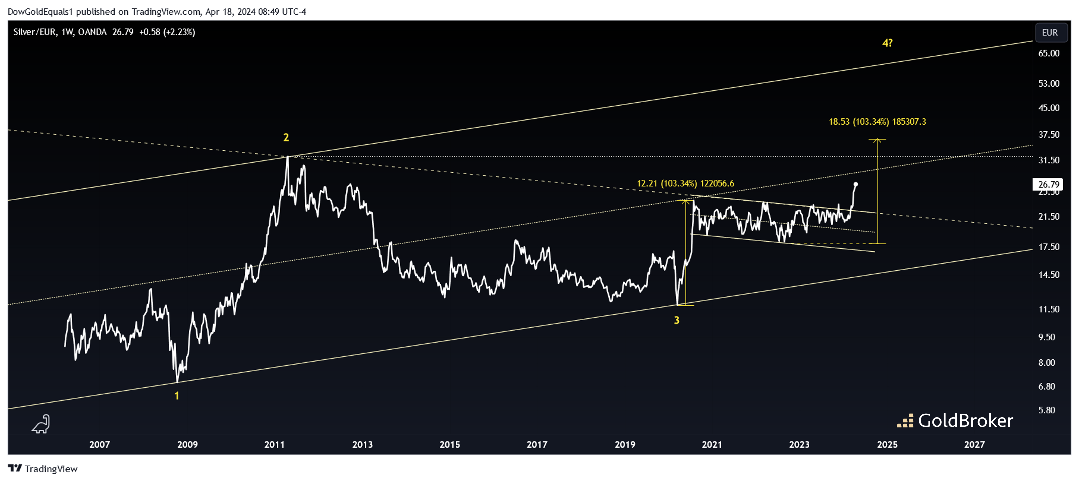
  We’ll start with Silver/Euro and note that the breakout we were looking for was from its bull flag that launched from the Covid low in 2020. We can see that over the past couple of months, the breakout has been impulsive indeed. Given that this flag consolidated for 3.5 years, there is certainly enough pent-up energy to propel the price to its 103% measured move. This is extremely important because such a move would take the price beyond its long-term channel mid-line as well as its all-time high set in 2011. Surpassing those two targets gives confidence that the price would then seek the upper rail of its long-term channel at $60 or higher depending on when it gets hit.
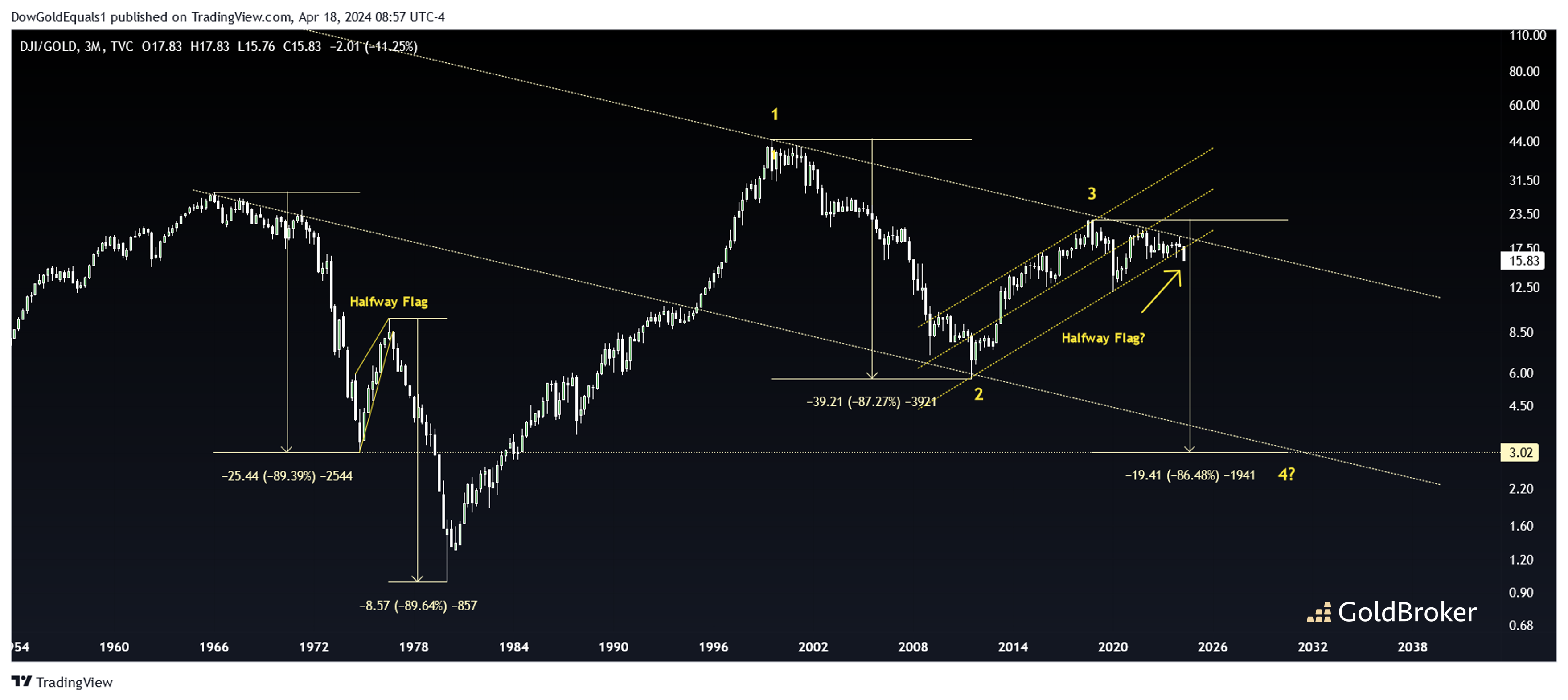
 The chart above is of the Dow/Gold ratio, which has just broken out of the bear flag we noted last year. Will this flag be a halfway flag like the one we saw in the 1970s? If so, let me remind you that the measured move is around 3, which may also coincide with a hit to the ratio’s descending channel. When the ratio plummeted in the 1970s, not only was gold soaring but the Dow also lost 50% as it consolidated between 1965 and 1982. As the ratio drops this time, I suspect similar behavior – Gold will rise as the dow is flat to down.More By This Author:Gold, Silver And Oil: Strong Rise Expected In May-June-July U.S. Consumers Strangled By Another Double Increase In Prices And Rates How Much Gold Do The French Own?


